Expressive Elements of Virtual Rewards in Fitness Apps
A research study identifying which badge design elements — percentile ranking, expert info, metaphor, or tangibility — most effectively drive exercise motivation and self-efficacy.
As mobile fitness apps proliferate, badge-based virtual rewards have become a primary lever for sustaining user engagement — yet the design principles behind them remain under-researched.
This master's thesis (Hongik University, Interaction Design, 2022) systematically analyzes the expressive elements that make fitness badges work. Through a case study of five major platforms (Samsung Health, Google Fit, Fitbit, Apple Watch Activity, Nike Training Club), the research extracts four differentiating design elements and tests them against users' exercise motivation (Keller's ARCS model) and self-efficacy (Bandura, 1997).
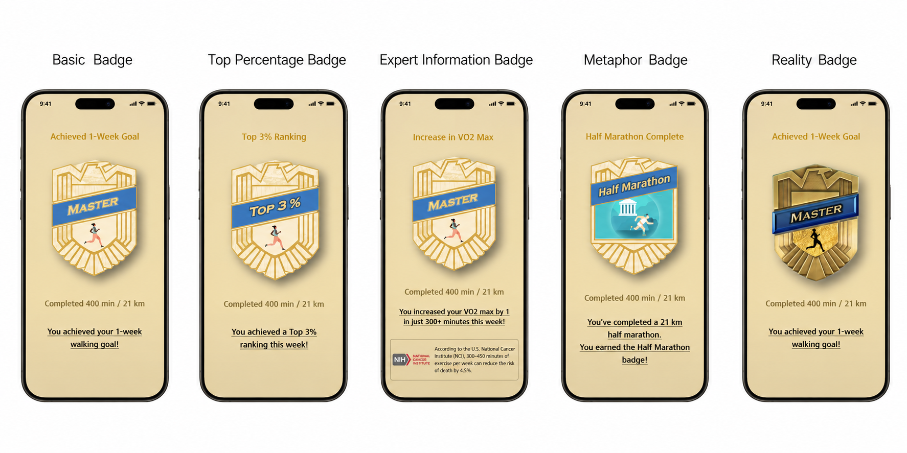
A set of five badge prototypes — Basic, Top Percentile, Expert Info, Metaphor, and Tangibility — was evaluated by 34 participants (ages 20–50) via survey, with 10 follow-up in-depth interviews.
Key finding: the 'Top Percentile' badge (showing the user's ranking against all participants) scored highest across attention, confidence, satisfaction, and self-efficacy — suggesting that social comparison cues, embedded in a competitive cultural context, are the most potent motivational signal a fitness badge can carry.
Every fitness app has badges. Nobody has studied what makes them actually work.
Fitness apps from Apple, Samsung, Fitbit, Google, and Nike all use badge-based virtual reward systems — but each implements them differently, and there is no established framework for what expressive elements a badge should include to maximize motivational impact.
Existing research confirms that motivation and self-efficacy are critical for sustaining exercise behavior (Bandura, 1994; McAuley et al., 1993), and that virtual rewards can promote physical activity (Ha, Karyda & Lucero, 2020) — but the design literature lacks a classification of the specific visual/informational elements responsible for those effects.
Research question: How do different badge expressive elements affect users' exercise motivation and perceived self-efficacy?
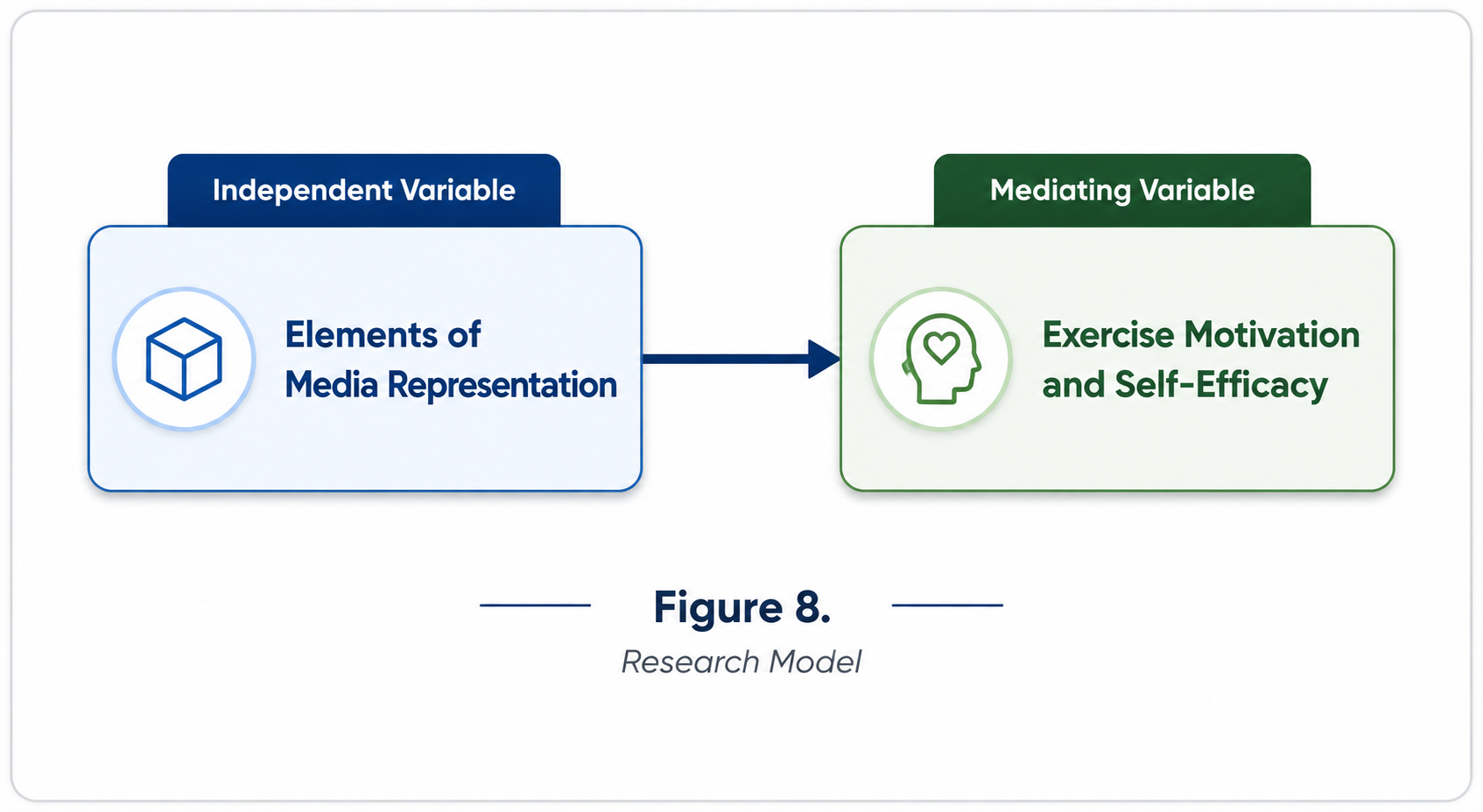
Five apps → four differentiating elements → five prototypes → 34 participants.
Phase 1 — Case Analysis: Five major fitness apps were audited for their virtual reward systems. All five shared a baseline of achievement numerics and completion messages; four distinctive elements were extracted:
· Top Percentile — Samsung Health's Global Challenge shows where the user ranks among all participants. · Expert Info — Google Fit surfaces WHO/AHA guidelines alongside the Heart Points score. · Metaphor — Fitbit maps cumulative distance to landmark journeys (Marathon → Great Wall → Earth Diameter). · Tangibility — Apple Watch and Nike Training Club render badges as physically-plausible 3D metal objects.
Phase 2 — Prototype Design: Five badge prototypes were built, each isolating one element (plus a Basic control). All prototypes shared the same achievement data and completion message to isolate the variable.
Phase 3 — Survey & Interview: 34 participants (ages 20–50, mobile-proficient) tested each badge prototype and rated it across 13 items mapped to Keller's ARCS model (Attention, Relevance, Confidence, Satisfaction) and Bandura's Self-Efficacy scale. 10 participants completed in-depth 1:1 interviews.
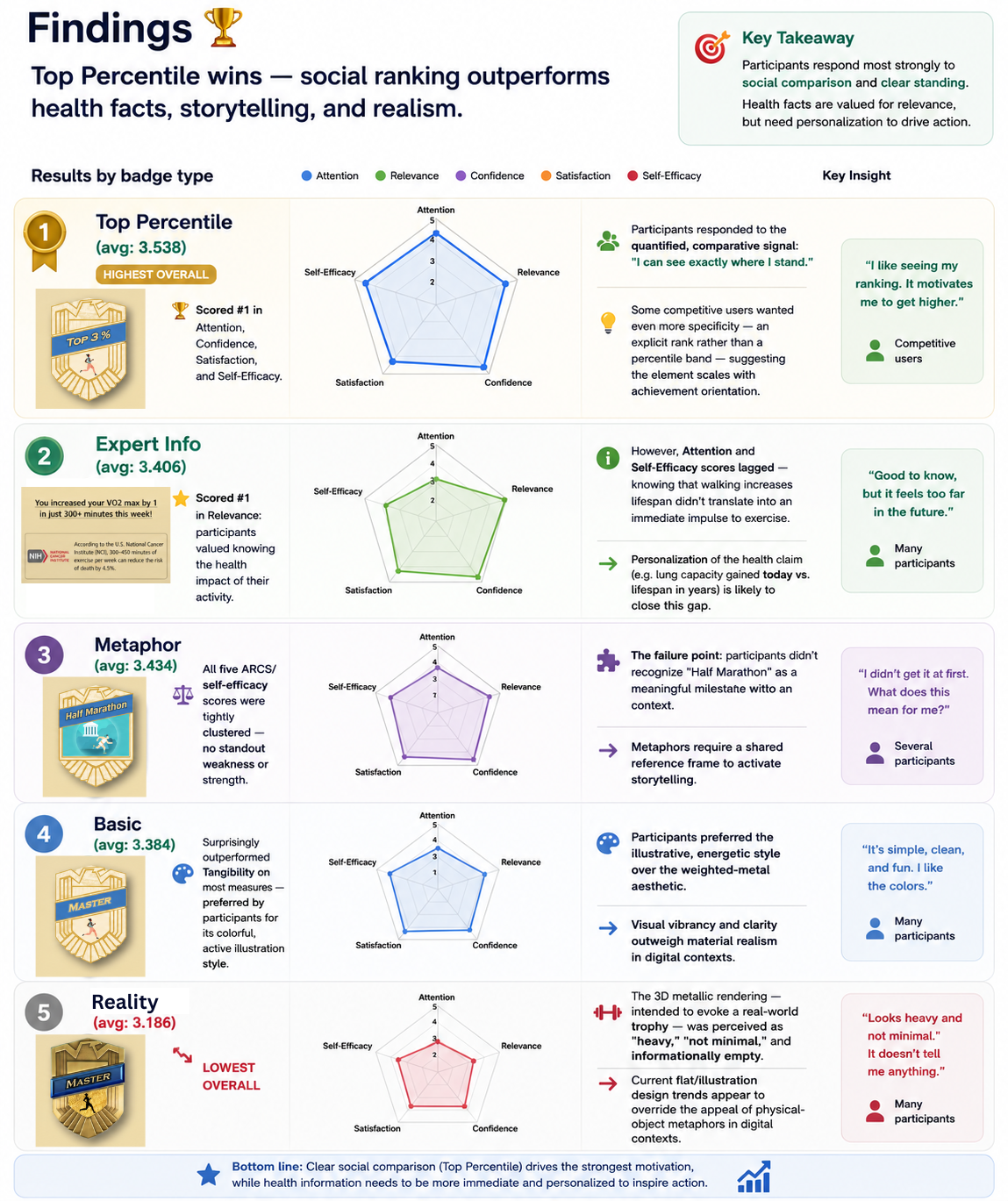
Top Percentile wins — social ranking outperforms health facts, storytelling, and realism.
Results by badge type:
① Top Percentile (avg: 3.538 — highest overall) Scored #1 in Attention, Confidence, Satisfaction, and Self-Efficacy. Participants responded to the quantified, comparative signal: 'I can see exactly where I stand.' Some competitive users wanted even more specificity — an explicit rank rather than a percentile band — suggesting the element scales with achievement orientation.
② Expert Info (avg: 3.406) Scored #1 in Relevance: participants valued knowing the health impact of their activity. However, Attention and Self-Efficacy scores lagged — knowing that walking increases lifespan didn't translate into an immediate impulse to exercise. Personalization of the health claim (e.g. lung capacity gained today vs. lifespan in years) is likely to close this gap.
③ Metaphor (avg: 3.434) All five ARCS/self-efficacy scores were tightly clustered — no standout weakness, but no standout strength either. The failure point: participants didn't recognize 'Half Marathon' as a meaningful milestone without context. Metaphors require a shared reference frame to activate storytelling.
④ Basic (avg: 3.384) Surprisingly outperformed Tangibility on most measures — preferred by participants for its colorful, active illustration style over the weighted-metal aesthetic.
⑤ Tangibility (avg: 3.186 — lowest overall) The 3D metallic rendering — intended to evoke a real-world trophy — was perceived as 'heavy,' 'not minimal,' and informationally empty. Current flat/illustration design trends appear to override the appeal of physical-object metaphors in digital contexts.
A design framework for badges that actually move people — not just decorate screens.
· Provides the first systematic classification of fitness badge expressive elements — a practical taxonomy for UX designers building gamified health products. · Establishes 'Top Percentile' as the highest-leverage single element for motivation and self-efficacy across a competitive-culture user base. · Identifies the limits of each element: Expert Info needs immediacy and personalization; Metaphor needs a universally legible reference frame; Tangibility is constrained by prevailing design trends. · Flags an important open question: real-world badges combine multiple elements — how do combinations interact? The thesis calls for follow-up research on multi-element badge compositions and their joint effect on motivation. · Contributes foundational research to the intersection of gamification design, health behavior, and mobile UX — with direct application to product decisions in fitness, EdTech, FinTech, and any platform using achievement systems.